How to Optimize Your Salesforce AppExchange Listing
No matter how small or big your company is, your listing should be fully updated and optimized at all times. If you are unsure what more you can do to improve your listing, or if you’re just getting started, I would urge you to think of it like Search Engine Marketing (SEM). The AppExchange treats listings like websites, by using algorithms to rank your listing on keywords, traffic, header content, reviews, rich body content, and more.
In this article, I will break down how to create or optimize your AppExchange Listing and how to treat your listing like a website. I will use Salesforce’s Map (MapAnything) listing as an example.
Let’s Get Started!
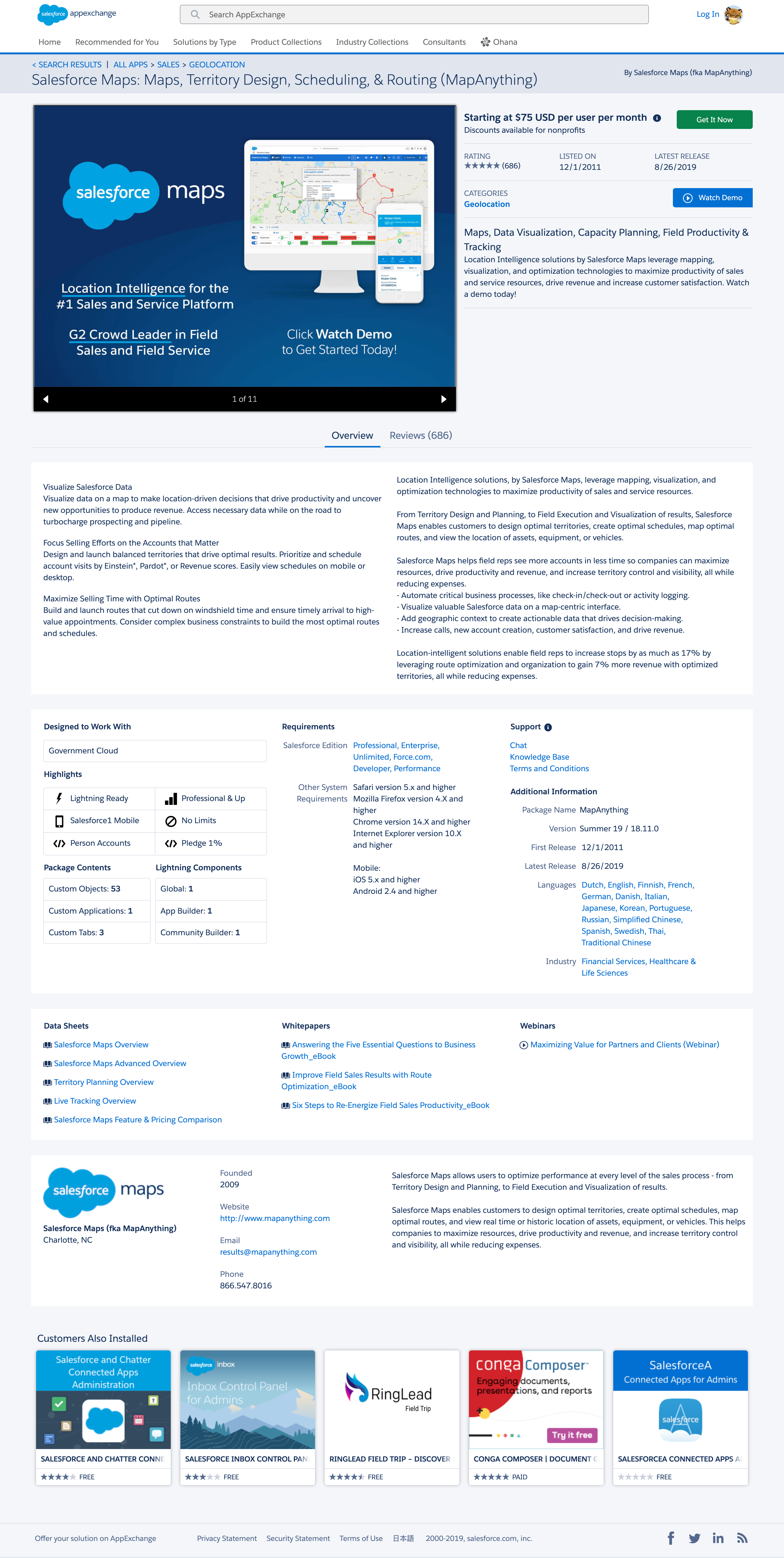
Quickly Review the Salesforce Maps listing below:
-
What really stands out to you?
-
Where does your attention first go?
-
What information are you looking to quickly gather?
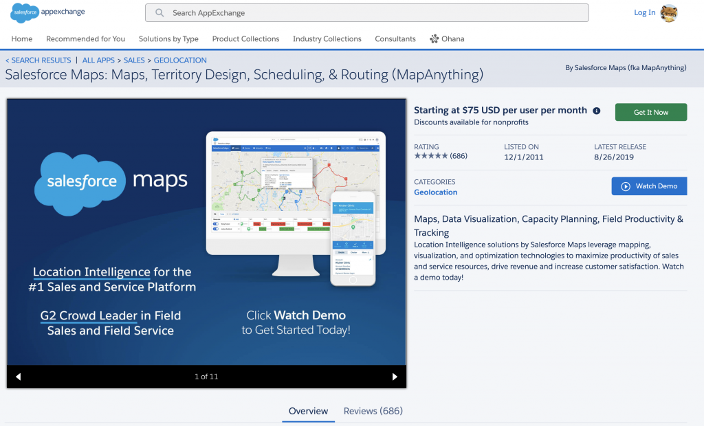
#1 – The Title: it should be short and quick. Notice how it provides the “name” and “app’s purpose” in just a few words.
#2 – Your First Screenshot/Slide: It should be bold, clean, and direct. Consider this screenshot to be the Master attention grabber, which is ultimately an image that can keep a prospect/lead on your listing or drive them away. It needs to convey multiple points on one screen and only has a matter of seconds to do so. In the example, notice how the company (Salesforce) is brightly and clearly branded. It provides a big screenshot on both a Desktop and Mobile device, letting you know the app works on both platforms. It states two key facts and provides a clear Call to Action (CTA), “Watch Demo”.
Notice how they used a nice blue background and a clean white text. This makes the copy (content) easily readable and clean (graphically). Consider using company colors to stay consistent with your branding, trust me, your slides will look AMAZING if you do this. The theme that you use on your first slide, should be consistent throughout all 15 slides, this includes, text (font & size), graphics, colors, branding, and more.
#3 – Price: In the past, you were allowed to post a listing that said, “Contact for Pricing”, but that is no longer the case. Salesforce now requires all listings to have price. Did you know that by simply not listing a price on your app’s listing, you could be driving potential prospects away? I highly recommend listing your price and any discounts you may offer. Being upfront with your prospects is not only the norm and a best practice from Salesforce but one of the proactive things you can do for your listing.
If we are being honest, prospects are lazy, even a few extra clicks are enough nowadays to drive fresh leads aways. So get away from the method of making them contact you to get pricing and just list it.
#4 – Call to Actions (CTA’s): Whether it’s your slides or the CTA’s on your listing, they should be bold and clear. Luckily, the AppExchange provides two very bold and clear ones for you. 1 – Get It Now and 2. Watch Demo. I highly suggest using these two! Not only are they two different colors, but they provide ways for your listing to generate leads. When setting up your listing, you can link your listing to your Salesforce org, assign a Lead Owner, and automate the lead intake process. This way, when a prospect watches your demo, you are on your game and ready to go. This is a MUST!
#4.5 – The Demo: The “Watch Demo” button is a strong CTA to have and very easy to set up. What about the demo video though? This video should be kept between 1.5 – 2 minutes long. If you really need the extra time, push it to 2.5 minutes but no longer. This Demo Video is meant to hook the prospect with catchy high-level information specific to your app. Generally, this demo should include; a brief background about your app, what it does, how it can help, 2-3 key features, how it can evolve/grow with the prospect’s company and as always “a clear CTA”.
#5 – First Piece of Content: Finally, you get to tell your prospects what your app does in your own words. Notice that there is a slightly bolded header above the content (on the right). Treat this header like a description of the content you are about the write. Be concise, short and clear. (This header is also a ranking factor, so choose your words carefully)
#5.5 – Once you have crafted your header, it’s time to move into the content. Consider this first content section a high-level pitch for your app. This is where you want to use strong and rich keywords that are unique to your app (another ranking factor) but still competitive in your industry.
#6 – Latest Release: Just below the green “Get It Now” button you’ll find, “Latest Release”. I am bolding this as it is VERY important, People Check This! In simple terms, imagine you are buying a car with 50,000 miles on it, you ask when it was last serviced and the dealership tells you, “at 8,000 miles”. That would be concerning right? That same message applies here. When people are looking to purchase or invest in a new app for their business, it is concerning to see that an app hasn’t been updated.
#7 – Categories: This is really simple, select the Categories that applies the most to your app. Now, understand that there might not be a perfect category for your app, this is where you leverage your Salesforce Account Executive (AE) or Partner Rep to get their feedback. Upon choosing the categories you want for your app, you will have to submit a case with Salesforce for them to update. It is a short and simple process, and yes this can affect your search results. I would also recommend emailing your AE or Partner Rep to ensure a timely change.
#8 – The Slides: As previously mentioned, Slide #1 is the Master and consistency is important. You are allowed a total of 15 slides. Slide #1 should be an eye-catching overview with a clear statement of what your app does while branding your company. The next 12 slides should be highlighting what your app offers the prospect and how it can help them. These can be screenshots, illustrations with wording, whatever you want. Some like to use multiple videos. In my opinion, I would save those for the end. If you are going to use more than one or two videos, drive them to your website or YouTube channel. Slide #14 and #15 should be the closers. Slide #14 brings everything to an end and light summary and brief CTA. Slide #15 is a clear CTA, what they need to do next! If you want to take a more aggressive approach, you can also throw a big CTA in Slide #2 earlier on.
Small break! Take a breather………and were back.
At this point, I hope I have conveyed just how much strategy and work goes into a simple AppExchange listing. Next up, the Overview and Reviews!
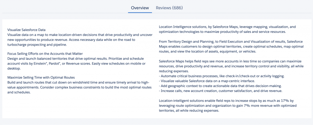
The Overview: finally we get to use a lot of words to convey “everything” our app does, right? No! This is a time to provide details but again, be concise as you only have three short paragraphs on the left side and just a little more on the right (see screenshot). The three points on the left are three different sections in the AppExchange Publishing Console.
I suggest conveying the three most important topics with high-level detail that every prospect “needs” to know. Content for the right side, here you will have a larger text space in the publishing console. This is where you can highlight a list of top features or even utilize it for diving into detail about your app.
Something to keep in mind, all of this content is indexed both by Google and Salesforce and it will affect your search results and ranking. That said, I suggest being strategic about the details you provide. Content is king, so use it wisely!
Reviews: These are important and they affect your ranking. Too many companies fail to seek reviews from their customers. Just like you upsell or market products to new prospects, you should be marketing for reviews to your current clients. Simply put, reviews can make a difference!
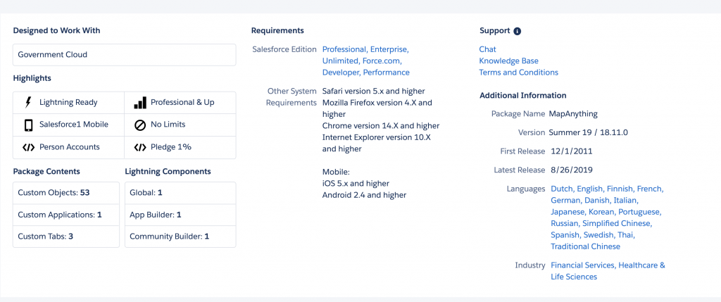
The App’s Technical Details: No matter how small or big, the details matter. This section (seen to the right) is crucial, as prospects doing research can easily confirm whether your solution fits their business needs and technical requirements. I would stress that you provide up-to-date and correct Support information. Allowing your prospects to directly access the correct person does nothing but set your company up for success.
This section in the publishing console is pretty straight forward, you list what your app offers and/or select from the pre-filled options.
Supporting Documentation: This section is really to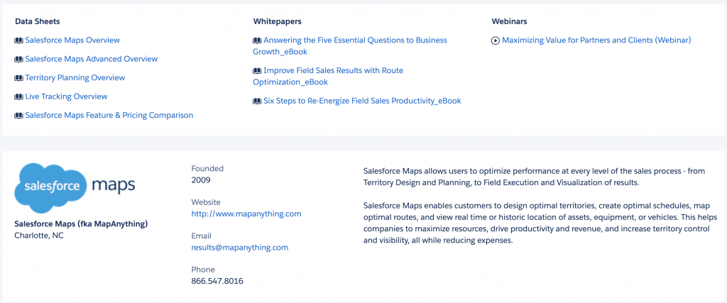 “close the deal” as they say. This section (seen on right) can be a breeze if you have already built out some of your data sheets, whitepapers, webinars, marketing flyers, and case studies. If not, do not stress it, you will build up your listing as you go. Providing documentation in this section really allows prospects searching for new solutions to do their due diligence without having to spend hours researching only to come up with little to nothing. Make the prospects life easier.
I used three screenshots for Salesforce’s Map listing, if you would like to see what the full listing looks like, you can view a full screenshot here or visit the live listing here.
Treating Your Listing Like a Website
Everything you put on a website gets indexed by search engines. Everything from the Html on the backend to the file name of the image you uploaded to your blog. In saying that, the same thing happens when you publish your app’s listing. You need to be strategic from the titles and headers to the images you use. Think of Search Engine Marketing (SEM) when creating your AppExchange listing.
By using an SEM approach, you can enable your listing to rank for both your keywords and your competitors. Sounds like a great deal right? This also allows you to competitively rank. What does that mean? The terminology (wording) that you use, might not be the same for one of your competitors. So you need to ensure that when a prospect does a search for your competitor, that you rank alongside them, while also ranking for your specific keywords.
How can I do this? It’s simple, you need to perform a competitor analysis and keyword search before and after publishing. This will give you a solid idea of what key words other players in the industry are using. Once you have those keywords, start writing! After you have crafted your listing content and perform your competitive search, get that app published. I would give the AppExchange anywhere from 2-6 weeks to effectively index and rank your app. The reason behind this time period; you need some time to let prospects visit your listing and for your marketing department to drive traffic to the listing. Once your listing begins to rank, it is time for your post competitive analysis. Make sure to perform a search for your top 3-5 competitors and see where you rank alongside them. If you are not ranking, look at the content used, check your review count, your traffic stats, etc.. At this stage, it should be clear why you might not be ranking with them.
It is important to note that your AppExchange listing will also rank in search engines, such as Bing and Google. So you should reach out to your SEO manager and get a list of your top 10 keywords. This way, you can be consistent with the keywords used on any paid ads, the company website, social and etc..
I hope this was helpful. If you have any questions or would like a review of your listing, feel free to contact me and we can schedule a call.